In the almost 60 year history of Africa’s continental body the African Union (and its predecessor the Organization of African Unity), the organisation has expanded the scope of its activities to encompass not only policy making organs but has also established various organisations whose role it is to ensure that the Union delivers on the mandates and that member states meet the aspirations of Africa’s citizens as envisaged in the Constitutive Act of the African Union. With the growth of the number of institutions, the African Union is also moving towards ensuring that the African Union brand is recognisable; representing one entity and brand speaking with one voice.
The need for one common identity was reinforced in the Decisions of the Executive Council and STC-CCICT which directed the Union to “Ensure the Brand and Communication Style Guide are instituted within the African Union Commission and the organs and institutions of the African Union and adopted and use in all Member States (See EX.CL/Dec.1143-1167(XL) (2022), EX.CL/Dec.1073-1096(XXXVI) (2020), AU/STC-CICT-4MIN/Decl (2021), AU-STC-CICT-3MIN/Decl (2019)
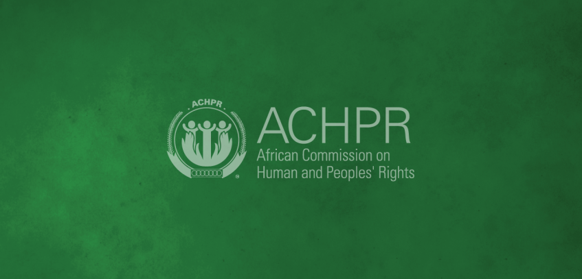
The re-branding and re-launch of the new brand identity of the African Commission on Human and Peoples’ Rights (ACHPR) is part of the on-going work to ensure all African Union Organs and Institutions stay true to the corporate brand and are recognised as belonging to the African Union family working in service to Africa’s people. The new logo and revamped website were launched at the opening session of the 73rd Ordinary Session of the African Commission on Human and Peoples’ Rights on the 21st October 2022.
The logo of the African Commission on The Human and Peoples’ Rights draws its inspiration from the African Union logo whose seal is similar in shape and graphical representation. Elements like the palm leaves (standing for peace), the gold circle (symbolizing Africa’s wealth and bright future) and interlocking red rings (signifying African solidarity and the blood shed for Africa’s liberation), the logo symbolically integrates the aspects of promotion and protection of human rights represented by the artwork in the seal, which also reflects the African Union as a people-centred organisation, whose development is people-driven, relying on the potential of its people.
The Creative rationale of ACHPR logo is an element of family, humanity and equal rights for the all Africans within the continent and those in the diaspora. We have three subjects that can be depicted as a form of togetherness, in the sense that we cannot achieve much if we are to act in solitude, we need more than ourselves as individuals. The flow and continuation of the raised arms amongst the individuals depict a bond that helps us achieve the humanity we all seek. It encompasses us, as a whole, irrespective of race, age or gender and depicted using the AU brand colours i.e Green, Gold and Red. The gold encircling hands reflect both the protection and promotion of human rights.


